

The first draft of IBNNZ logo design.

The second draft of IBNNZ logo design.
Concept:
1. Grids letters stand for technology, network.
2. ‘I’ for ‘Indonesia’, red and white colors mean Indonesia flag.
3. ’B’ for ‘Business’, pick the colour from New Zealand flag and cold blue colour means calm.
4. Use red, white and blue colors, which are on the flags of Indonesia and New Zealand, to show ‘N’. The red color grids in ‘N’ also seen as a smaller ‘N’ and the blue color grids in ‘N’ seen as a smaller ‘Z(rotate)’.
5. Put company’s full name down at the ‘IBN’.
6. The shadow behind ‘IBN’ make the logo stand out on any background colour.
6. The shadow behind ‘IBN’ make the logo stand out on any background colour.
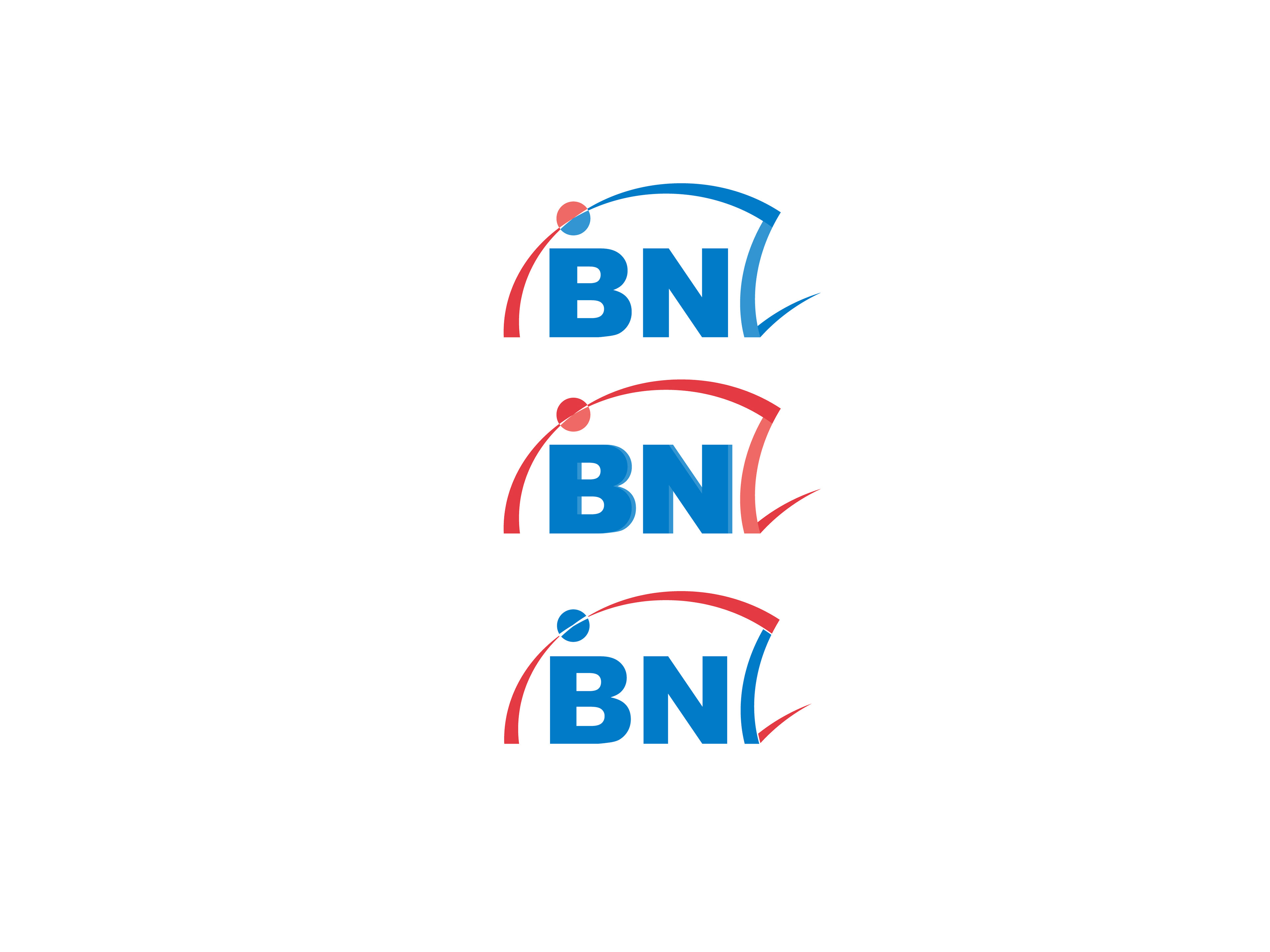
The third version of IBNNZ logo.
Concept:
1. The curve stands for ‘Indonesia’ and ‘New Zealand’ connecting together.
2. Bold letters ‘BN’ are standing out in the curve.
3. Colors come from Indonesian and New Zealand flags.